Redefining search across T-Mobile.com
Unifying a fragmented search experience across T-Mobile.com to improve content discovery and relevancy.
🔍 Search with the live site
My role
Lead design
Launched
Sep 2019
Timeline
2 months
Client
T-Mobile
The opportunities
T-Mobile's search experience was fragmented and outdated. There was a lack of consistency and interaction pattern between its sites across different business units, as well as for authenticated and unauthenticated experience.
On-site search serves as a critical driver for discovering everything from T-Mobile, needed a redesign. As the lead designer, I was tasked to reimagine, define, and design the search experience for the t-mobile.com.
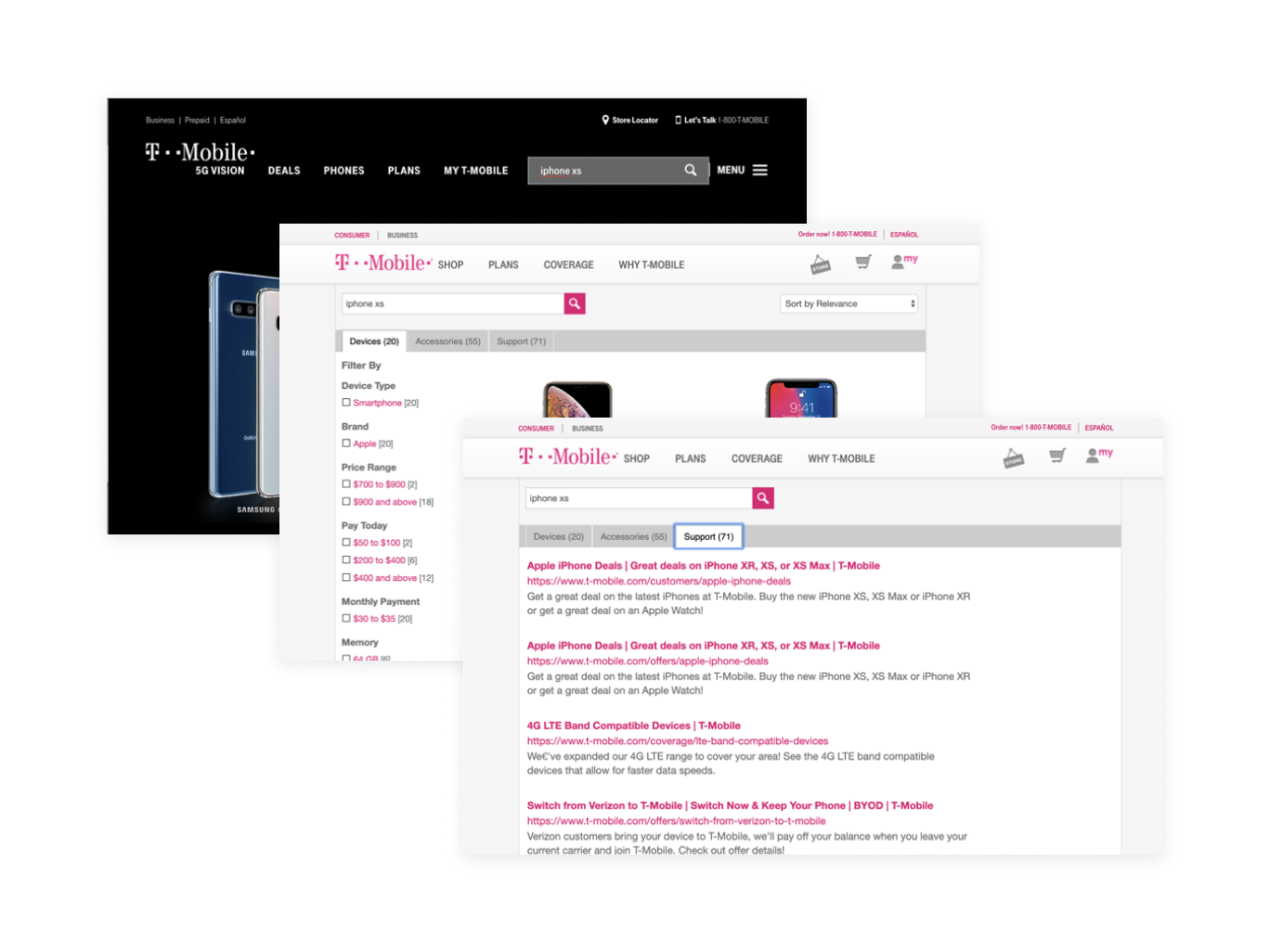
Before
A fragmented experience across the websites.
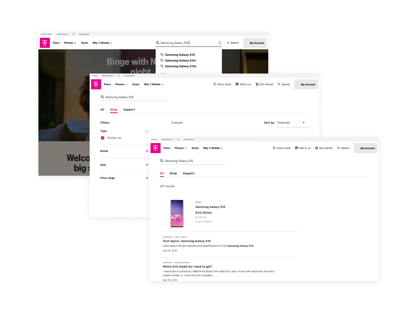
After
A scalable framework where the users can discover content with recommendations and suggestions.
What we knew 🤓
From past research, we discovered that performing an on-site search is a strong behavior predictor of intent to convert, which is the primary business goal for T-Mobile.com. However, we learned that the biggest pain-points with the current search experience are around the irrelevancy of the content and the lack of organization of its result page. Specifically —
Seasonal events and announcements influence the type of content people are looking for
For consumer content, from the monthly web analytics, we saw that search terms are driven by seasonal events (e.g. Christmas, Thanksgiving, Graduation) and device announcement (e.g. new iPhone). For both authenticated and unauthenticated experience, device and service information are the top two search categories. However, account-related, and support content are also topped search query for authenticated experience (e.g., Order status, payment arrangement, change number).
People want relevant results with an option to explore more
From several prior rapid prototyping and testing pilot studies, we saw that people expected to see a full picture of what they are searching for. For example, people like the option of auto-populating search terms while they are typing but want it to be not overwhelming (show example). They also expect an option to see all search content while having the ability to toggle between different categories. They also saw a need to see contextual content such as signing up for notification of new device launch when searching for the relevant terms.
Highlighted findings from the pilot studies.
Setting a north star 🌟
A nimble interdisciplinary team was assembled with business stakeholders, product managers, developers across the client business. To design a universal search experience to serve the needs of multiple audiences ranging from prospects to existing customers, from investors to journalists, together with our clients, we set a north star for the search experience:
A contextual experience based on where the user is coming from, and present actionable search results that quickly direct the user to where they want to go.
This also manifested to the following design goals:
For customers and other site visitors:
An experience that is personalized, predictive, and relevant, while quick and easy to use.
For business owners and content curators:
A scalable framework that can be curated and customized across the all line of businesses.
The Design
Search as part of the navigation
As part of the redesign effort, we were also rethinking how navigation works across all T-Mobile.com. It was designed as a configurable kit where different sites can customize it based on their customer behaviors and business needs. Based on the navigation framework, Search is considered as part of the utility links as can be utilized to addresses critical tasks or functions of different customer journeys.
On mobile, certain utilities will be prioritized over others. For instance, because the main reason that the customers come to the consumer site is to shop, commerce features such as "find a store" or "shopping cart" will be highlighted instead of search. Alternatively, a customer can still search within the hamburger menu when needed.
Entry point options for the onsite search.
A contextualized experience based on where you are
Although customers can search from any place across the sites, they might not know what content the website contains or what they can search from. As such, we want to design an experience that's relevant to where they are and what their intent might be.
A demo for the the baseline experience for onsite search.
This experience was manifested in three ways:
Placeholder text to clarify their expectation and the scope of the search
Search suggestions that are curated base on web analytics or business recommendation to quickly link the user to a page within the site or a predefined search result (authenticated vs. unauthenticated)
As seen from the baseline experience demo above, Autocomplete that predicts what the users' intent might be (authenticated vs. unauthenticated) to make the search relevant and actionable. For instance, when the customer enters “Samsung Galaxy S10”, we surface the link to the product page of the Samsung Galaxy S10 in the Shop site to allow them to navigate to their desired content with fewer clicks. Additionally, a search result tab will be preselected based on what the keywords were rather than defaulting to all results.
A flexible search result page
Based on past insights, the search result page was designed to be able to scale and adapt based on the search keywords.
Through iterations, I also make sure the result page is scalable for different types of content while keeping it easy for the user to digest and explore further.
Define how search result item works across all types of search results, highlighting the minimum information that is needed for the users to understand what type of result it is
Ability to display featured result, one at a time.
A clear indication of the type of result, the number of results, and ways to filter or sort.
A section for related search terms that allows the customer to discover other related search results.
A sample of the UI components for the search experience.
Learning by doing 🥺
Content comes first before search
One of the first things I learned from the initial research was that relevancy of the page content drives the quality of the search result. This means no matter how flexible or smart the search could be, if the page content didn't include the information that the customer is looking for, the experience still suffers. I worked with business stakeholders and content designers to audit and create the new content strategy framework of the website, which in the end, help inform how old content will be migrated and how new content will be created.
Translate the new design system to product design
As part of the redesign efforts, we implemented a new design system that would be used for products across platforms such as marketing, commerce, and customer support products. It is the first attempt for our client to aligned marketing design with product design. Partnering with the design system designer, we defined how elements such as color, typography, UI elements are incorporated to create layouts, page cadences, motion patterns, and communicate user flows.
Work nimbly and collaboratively
With only 1 month to learn and create a solution that is not only feasible to launched in two months but also viable for the web production team to incorporate into their workflow. I worked closely with both the business and technical stakeholders to define what the minimum viable product would be, and how can the in-house team could continue the iteration once it launched.
This means showing work-in-progress work early, and having working sessions together to gain buy-in quickly, as well as detailed documentation that lives beyond the end of the handoff process.
Sample of design documentations shared with the development team.
The launch is only the beginning 🎢
The baseline search experience was launched in September for the consumer site, and it is only the beginning. With the new search experience implemented, the team would be able to continue iterate and implement new feature as the website continue to migrate.


